Modify Your Website's Colors
Choosing colors for your website is an important design decision that can have a significant impact on the overall user experience and can help to establish your brand identity.
In this guide, we'll cover the following topics. Click on anyone to jump ahead.
Change Color Palette
When building a new website with Nucleus Web, we recommend starting with your Design Settings. Here, you'll set things like your Colors, Fonts, Header, Footers, Media presets, and more so that these design styles apply to whatever you're about to build. To choose your colors head to Web, then Design, then click Colors on the left-hand side.

To get started with Colors in Nucleus Web we recommend choosing a Color Palette. These are eight suggested color palettes that we've curated for you by hand that we think look snazzy. Don't worry, all of these palettes can be changed, customized, and even saved later!
To choose a Color Palette you'll want to click the Change Palette button on the right hand side.

You'll be presented with eight different options as well as a brief description of the color palette.

Go ahead and pick one that you like! Again these can be adjusted or changed if you want in the future, so don't fret.
Construction Of A Color Palette
Color Palettes are constructed of eight colors.
-
Color 1 typically applies to "Section Palette 1" Background.
- Color 2 typically applies to "Section Palette 2" Background.
- Color 3 typically applies to "Section Palette 3" Background.
- Color 4 typically applies to "Section Palette 4" Background.
- Color 5 will be used primarily for the text on your website.
Note: if there is not enough contrast for legibility on a section palette, the text color may change to use an appropriate contrasting color from this palette.
- Color 6 will be used primarily for the buttons on your website.
Note: if there is not enough contrast for legibility on a section palette, the button color may change to use an appropriate contrasting color from this palette.
- Contrast Color 1 is a lighter contrast color is used to ensure legibility and readability on your website when one of your other colors doesn't work. In almost every case, this light contrast color should remain in the very light (almost white) part of the color spectrum.
- Contrast Color 2 is a darker contrast color is used to ensure legibility and readability on your website when one of your other colors doesn't work. In almost every case, this dark contrast color should remain in the very light (almost black) part of the color spectrum.
Customizing The Colors
When customizing the colors in your Nucleus Web design settings, you have ultimate flexibility thanks to the four areas of configuration.
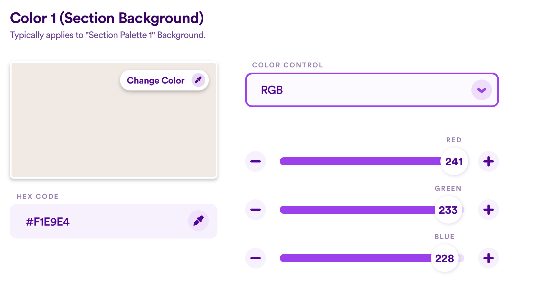
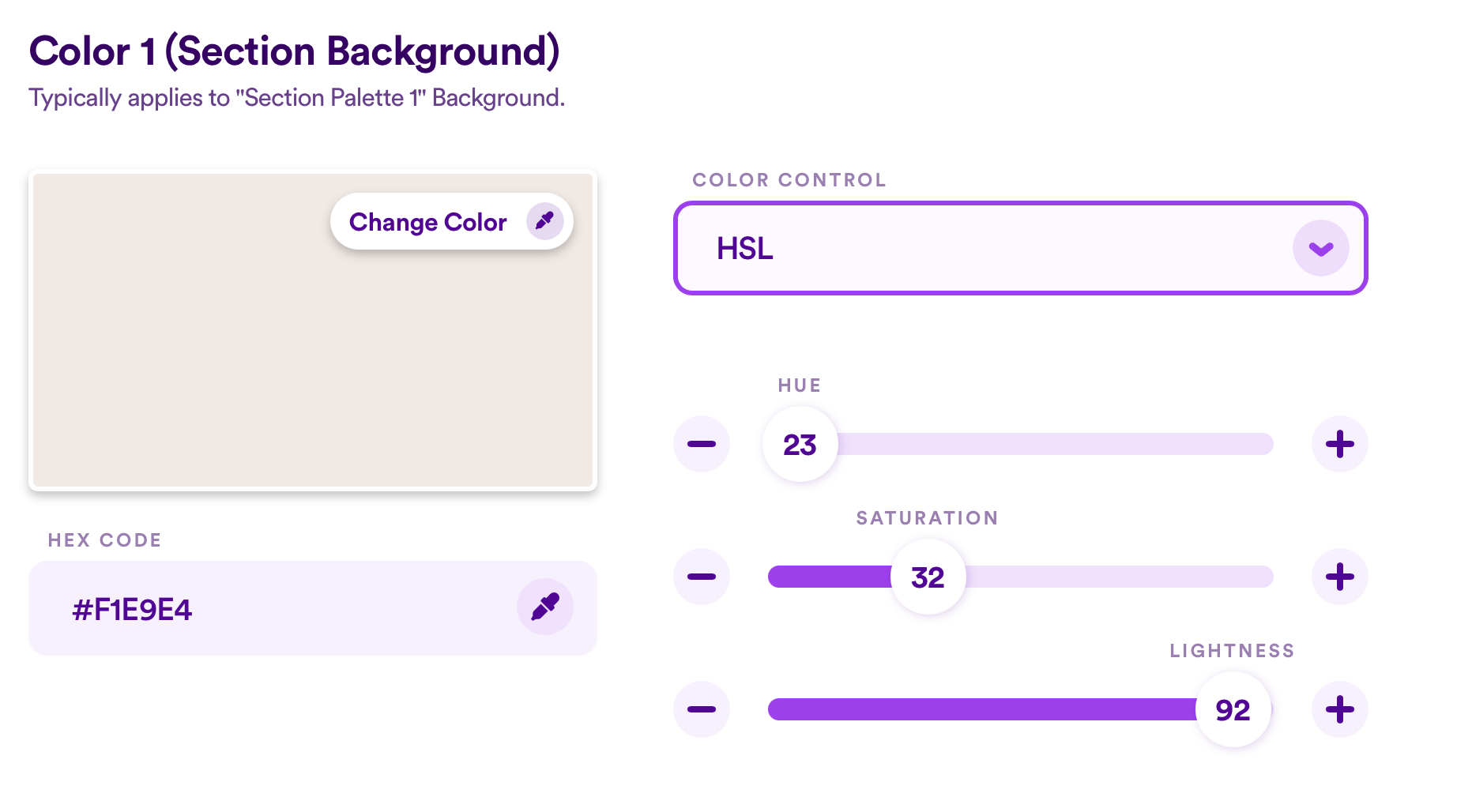
The Color Picker, the Hex Code field, the HSL control, and the RGB control.
For playing with a color palette from scratch, try using the Color Picker to find some inspiration. Simply click on the eye dropper tool on the Change Color button, and begin clicking and dragging until you find something you like.

If your church already has strong brand identity and some design guidelines, don't look any further than the Hex Code field. Easily copy and paste your church's brand color code into the field. You're off and running!

For more granular and creative control, give the HSL and RBG sliders a shot. HSL stands for Hue, Saturation, and Luminance. When selected, you'll be able to control each value using a slide. Switch to RGB from the Color Control dropdown to manipulate the Red, Green, and Blue values.


Saving A Custom Color Palette
Once you've made some edits to any of the preloaded Color Palettes or created one of your own entirely from scratch, you'll notice a new button appear - Save as Custom Palette 🎨

This feature allows you to customize any palette to your heart's content, and save it for future use. After making your edits, simply click on that new button and save your new palette. Give it a name and identity to make sense of it for your entire team.

You can now rest assured knowing that if you play around with any edits in the future that you don't quite love, you can always reset to your branded palette.
What Next?
Once you’ve decided on your Colors, it’s time to move along to your Fonts. Not only will the design options feel familiar, your fonts are another vital piece of your brand identity!
