Section Types: Cards
The Cards Section is a fantastic way to display a variety of clickable cards. These cards provide a summary (image, title, and short description) of what a visitor can expect to learn more about, or take action on, when they click on a card.
Adding cards to your website can help declutter a webpage by presenting snippets of information about a particular event, person, or something else, rather than having all of the information displayed in full on the page.
For instance, if you have lots of small groups, you can create a page with a Cards Section showcasing all the various small groups offered so that a visitor can quickly scan and find the one they’re looking for. They can then click on a particular card to learn more about that small group, rather than scrolling through a page with every single small group explained on one, long, never-ending page.
To begin, click on Pages in Nucleus Web. Click here for a quick link. Then click Edit on any page, or click + Create Page to start afresh and follow the instructions on the screen.

Note: Editing a section involves much more than focusing on the specific type of section. For instance, there are a slew of design and layout options you can choose for every single section you add to a page. This guide focuses specifically on the uniqueness of the Cards Section.
In this guide, we'll cover the following topics. Click on any one to jump ahead.
- Add A Cards Section To A Page
- Two Ways Of Adding Cards: Dynamically & Manually
- Add Cards Dynamically: From A List Of Pages
- Add Cards Dynamically: Pick & Choose Pages
- Add Cards Manually: From Scratch
- Customize How Cards Are Displayed
- Preview Your Page
Add A Cards Section To A Page
As explained in this guide, Nucleus pages are built using sections. There are several types of sections to use, but we’ll focus on adding a Cards Section to a page.
To add a Cards Section to a page, go to your Pages Panel here and click on any page to edit it. (If you don’t have any pages to edit, you can always edit your Homepage. Alternatively, you can create a new page. Click here to learn more about how to do that.)
While in the Page Editor, click on + Add New Section.

Then, click to add the Cards Section.

Next, select a layout for how the information in your section will be displayed.

Note: Many section layouts allow you to showcase text along with whatever type of specific media/content you want to add (like cards). This guide will only explore the specifics of adding cards. The text features rely on how the Information Section functions. To learn more about adding text to a section (and subsequently learn more about the Information Section), click here.
Finally, give your section a name. (This is purely for admin organization purposes, so it doesn’t have to be anything fancy.)

Then click Save & Start Editing.
Note: This article will only focus on the unique functionality for the Cards Section. To learn more about how to edit the layout and design of a section, click here.
Two Ways Of Adding Cards: Dynamically & Manually
Before exploring the steps of how to actually add cards to your Cards Section, it’s important to know the difference between adding cards dynamically and manually.
Dynamically adding cards means linking to other pages that you’ve already created and pulling information from those pages (like their page names, descriptions, and image) without you having to input that information manually.
You can choose to select these pages individually, or if you’ve added a bunch of pages to a List, you can select a specific List and then all the pages in that List will populate as cards automatically.
Note: To learn more about creating a List and adding pages to a List, click here.
Manually adding cards means creating each individual card from scratch. This means for each card you create, you are manually adding titles, descriptions, images, and where it links out to; rather than Nucleus automatically pulling that information from pages that already exist.
While adding cards dynamically works great when linking directly to corresponding pages, creating cards manually lets you link cards out to other types of actions, such as your GivingFlow, PrayerFlow, or another custom Flow. You can also link out to other URLs or even link a card to a file that you’ve uploaded.
Both ways of adding cards to your Cards Section have their place. So let’s explore how to add cards in both ways.
Add Cards Dynamically: From A List Of Pages
As explained above, to add cards dynamically, you need to have created at least one other page on your website. Of course, if you’re looking to add cards based on pages in a List, you also need to have done that too.
Note: If you’re interested in learning more about creating and managing Lists, click here.
First, click Begin Setup.

Then, select From Pages (Dynamic).

With From A List Of Pages selected, below you can select a specific List in the dropdown menu.

Below, Nucleus will show how many cards will be created, based on how many pages are included in the chosen List.
Then, click Save Changes.
Immediately, you should see all the cards created, using the information from each page in that List. You’ll also notice that the order that the cards are in depends upon the order that the pages appear in the List you selected. This means if you want to reorder the cards as they will appear in this section, you will need to go to that specific List in your Pages Panel and reorder the pages there.
Note: If you’d rather be able to reorder cards from a List, or add some cards based on a List but remove other cards that otherwise would be added, check out the Pick & Choose Pages method below.
While each card will link directly to its corresponding page, you’ll still need to edit the text, behavior, and style for the button that links to each page.
To do this, click Edit on each card.

Here, you can add your own CTA / button text, choose whether you want the page to open in a new tab in your browser, and what style of button you want for the card.
Note: Button styles can be designed here in your Design Panel.
Once you’ve customized a button, click Save Changes.
Add Cards Dynamically: Pick & Choose Pages
As explained above, to add cards dynamically, you need to have created at least one other page on your website. Of course, if you’re looking to add cards based on pages in a List, you also need to have done that too.
Note: If you’re interested in learning more about creating and managing Lists, click here.
First, click Begin Setup.

Then, select From Pages (Dynamic).

With Pick And Choose Pages selected, click Save Changes.

Now you can begin adding cards. To start, click + Add New.

To add cards by linking individual pages, select Page By Page. Then start typing the name of a page, or click the dropdown menu to find your page. Click on the one you want to use.

To add more, click + Add Another and repeat that process until you’ve linked to all the pages you want to the cards in your Cards Section.
Otherwise, if you want to add cards based on pages in a List, select All pages In A List. Then start typing the name of a List, or click the dropdown menu to find your List. Click on the one you want to use.

Either way, you’ll finish by clicking on Add New Cards.
Now you’ll see all the cards you’ve just added.
While each card will link directly to its corresponding page, you’ll still need to edit the text, behavior, and style for the button that links to each page.
To do this, click on a card.


Here, you can add your own CTA / button text, choose whether you want the page to open in a new tab in your browser, and what style of button you want for the card.
Note: Button styles can be designed here in your Design Panel.
Once you’ve customized a button, click Save Changes.

Additionally, you can delete a card you’ve added by clicking the down arrow and selecting Delete.

You can also reorder the cards so they appear in a different order. Simply click the two lines on a card, drag it up/down, and drop it to your desired spot.

To add another card from this view, click + Add Another.
Add Cards Manually: From Scratch
If you don’t have any pages in mind that you want to dynamically link to, you can add cards manually that can link out to other types of actions or URLs.
First, click Begin Setup.

Then, select From Scratch (Manual) and click Save Changes.

Next, click + Add New.

Here, you can create your first card. You can give your card a Top Label, Title, and/or Body (Description) text. None of these are mandatory fields, so however you want to fill these out (or not fill them out) is completely up to you.

Next, you can upload a photo for the background of your card. Simply drag and drop an image from your device. Or click + Add Image and a file browser for your device will appear and you can select to upload an image that way.

Below this, you can choose what you want the card to link to. There are several options to choose from, each with their own unique options.
Simply follow the instructions on the screen for whatever option you choose.

Lastly, give your CTA button some custom text and click Done.

Now you can click + Add Another to continue manually adding more cards, or you can click the down arrow and Duplicate the card you just created. (You can also choose to Delete a card in this way.)

Once you have multiple cards created, you can reorder them. Simply click the two lines on a card, drag it up/down, and drop it to your desired spot.

Customize How Cards Are Displayed
Once you have all your cards added, you can click Customize Display to, well…customize how the cards are displayed 😁 This will apply to all the cards in your section.

First, you can change the layout of your cards.
This includes where the information (title, description, etc.) is anchored and how that text is aligned on top of the cards.

You can also choose to have the cards live inside of the section:

Or take up the full width of the section:

Additionally, you can choose whether the cards themselves (not the text) align to the left, right, or center when stacked on top of each other.

Lastly, you can choose what information you want to display on your cards:
- Image
- Top Label (Overline)
- Title (Headline)
- Description
- CTA (Button)
In the Behavior tab, you can choose how your cards display on desktop versus mobile. You can have your cards stack on top of each other depending on the screen or browser size. Or you can have all your cards in a single row (no matter the screen or browser size), but have arrows to click on to move left/right through the cards, or to swipe left/right on mobile devices through the cards.

Next, in the Colors tab, the Match Section option will be selected by default. This means where your cards are displayed, any background colors and texts will use the same colors selected for the entire Section.
By selecting Use Custom Variation, you can choose between 4 different palettes that are generated by your Colors in the Design Panel here. This means if you have other text or images in this section (depending on the layout of the section you’ve chosen), you could have a different color variation on the text and images of your cards.

Both the Media tab and Background tabs allow you to manage and manipulate how the images in your cards are displayed.
Looking at the Media tab, there are two options to choose from: Inline or Fill Card.
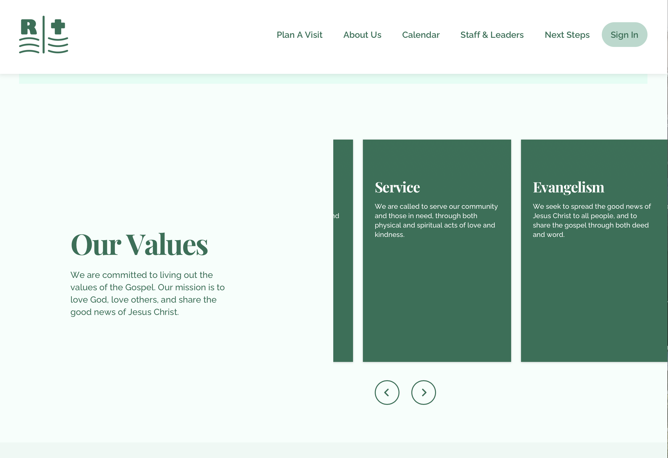
When Inline is selected, it breaks up the card into three parts and will look like this:

The top of the card showcases an image. If you’ve added cards dynamically, this image will be pulled directly from each individual page’s basic info.

If you’ve added cards manually, this image will be the image you’ve uploaded to each individual card in the section you’re currently working on.

Below this image, you’ll see the card’s info (text and button) and a background image (which you can manage in the Background tab).
However, if you choose the Fill Card option, the Media image will now fill the entire background of the card, hiding any image uploaded in the Background tab. (Any text will also appear higher on the card too.)

Under these two options, you can choose to Use Media Preset or Custom.
Image presets are extremely helpful to establish if you want images on your website to have a cohesive look and feel. You can set up and manage your media presets here in your Design Panel.
In most cases, if you have media presets established, you’ll likely just use that setting here. But should you want to adjust how the media shows up on your cards, you can choose Custom and make your adjustments below.

As you adjust those settings, you can see a preview of what this will do to the images on your cards.
If you make a bunch of changes and want to reset, you can always click on Reset to Preset to start over.
Going to the Background tab, you can choose to Use Media Preset or Custom. This applies even if you don’t have any background image uploaded because your background can also just be a solid color.
To upload a background image, select Image under Background Media.
Then, simply drag and drop an image from your device. Or simply click + Add Image and a file browser for your device will appear and you can select to upload an image that way.

If you want to customize the look and feel of your background image, select Custom under Choose A Style.

Below your image, you’ll see the same type of settings to adjust the treatment on the image as you did in the Media tab, with one additional option to adjust the color of your background.

By default, the background color will use your section’s Theme Color. But you can choose your own by selecting Custom and then clicking the color selector or entering in your color’s hex code.

All changes you make while customizing the display of your cards are automatically saved, so don’t worry about forgetting to save your edits while making your way through each tab.
Additionally, there are tons of other features and settings you can edit for your Cards Section (as you can any other section types). To learn more about how to change your section layout, add media or actions, or edit any other stylistic elements of your section, click here.
Preview Your Page
In all places where you can create and edit your web pages or design options, Nucleus operates with an autosave feature. At any point in time, you can choose to preview your website to see how your changes in your Dashboard are affecting your website as a visitor to your site would see it.
Simply click Preview in the top right corner.

This will open a new tab in your browser and will take you to your Nucleus Web preview URL.
To go back to your Dashboard, click on the appropriate tab in your browser.
Note: Clicking on the Preview button will always open a new tab, so unless you close out each preview tab opened, you’ll end up with several tabs opened with different iterations of how you’ve changed the design of your website.
What Next?
The Cards Section isn’t the only type of section you can add to a page. Check out some of these other guides to learn about different types of sections you can add to a page in your Nucleus website: